Olly Moss:
Olly Moss is a young, British graphic designer born in 1987 in Winchester. Despite only being 23 years of age his work has caught the eye of The New York Times magazine, The directors and creators of popular T.V series ‘Lost’ and the executives at popular fashion outlet, Urban Outfitters.
Moss’ work is in a variety of different mediums. Most of these are either illustrations or vector Images. Most of his work has quite a retro style and many of the images have Noise filters on to make them look more grainy and aged. From looking through his archive it becomes apparent that a lot of his influences come from music, film and computer gaming. He has designed many film posters in his own style using mostly just two block colours and silhouettes which is very effective.
He has worked for a variety of different companies from magazines through to fashion designers; some of these include Levis, Nike and Puma. He also designed the book cover for penguin book “You Are Not a Gadget, A Manifesto” by Jaron Lanier. For this he took a comical approach and used an image of a kindle (a tablet like device that can hold up to 1000 books). On the screen of the kindle he had the book as it would actually appear in real life. However this is quite a contradiction from the title of the book.
I think that the reason that I like Olly Moss’ work so much is because he takes this comical approach with everything he does and this gives it a very light hearted but it also makes it seem quite clever. He also takes subjects that are still quite taboo in our society and makes jokes out of them. I think this is a good thing as it makes people realise that we don’t have to be so uptight about such things. I think that if he can make people think about things just from looking at his pictures, even if they don’t partially like his work, then he has achieved more than most people ever will. It is very important to me that my work means something and makes people think otherwise I don’t think it has much point.

^
This is my favourite piece that I have seen by Olly Moss. It is not particularly complexed and it is not about anything practically important but it is funny and it is actually very true. It makes me think about all the different way that you can know what people are like without talking to them as this is a very important skill in life. This picture was most likely done using vectors as it is a very clean image and there are no photographs involved.
In my opinion Olly Moss is a very clever graphic designer who can do an extremely simple piece of work but it can have so much meaning and this is what I would like to be able to do with my work. All I wish to do in life is make people stand back and think about it.
Corey Holms:
Corey Holms' name has been well known to designers for over a decade and in this time he has worked on a lot of major projects and made himself very well known in the industry. He originally came from southern California and now lives in Fullerton. He studied at the California Institute of the Arts and graduated in 1996 with a BFA in Design. He runs his own private practice as well as working for agencies. His field of work consists of Identity, Type and entertainment design. His work has been seen all over the world and he has also written articles in many big design magazines on Typography and Type history. Holms designed the logo for hit T.V series ‘The Sopranos’. Simply substituting the ‘r’ for the gun made it an iconic piece in the world of design and culture. This has since been used in many other similar logo’s and has been parodied by another Hit show ‘Family Guy’. Such a simple change has made such an impact on the world of television as I would expect that most people who watch t.v/ Film will have seen this logo or something else buy him.

Corey Holms:
Corey Holms' name has been well known to designers for over a decade and in this time he has worked on a lot of major projects and made himself very well known in the industry. He originally came from southern California and now lives in Fullerton. He studied at the California Institute of the Arts and graduated in 1996 with a BFA in Design. He runs his own private practice as well as working for agencies. His field of work consists of Identity, Type and entertainment design. His work has been seen all over the world and he has also written articles in many big design magazines on Typography and Type history.
Holms designed the logo for hit T.V series ‘The Sopranos’. Simply substituting the ‘r’ for the gun made it an iconic piece in the world of design and culture. This has since been used in many other similar logo’s and has been parodied by another Hit show ‘Family Guy’. Such a simple change has made such an impact on the world of television as I would expect that most people who watch t.v/ Film will have seen this logo or something else buy him.Another massive part of Holms’ archive consists of entertainment media or film posters. He has designed posters for such films as ‘Where the Wild Things Are’, ‘Enemy of the State’, ‘Lost in Translation’, ‘The Time Travellers Wife’ and many others. He was also the main designer for the film posters of ‘The watchmen and from my point of view being given the opportunity to design the film posters for one of the best and probably most famous Graphic Novels of our time would be a huge honour. The artwork in the watchmen graphic novel is breathtaking as it is and it’s a huge responsibility.
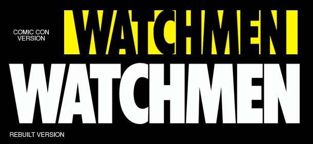
In fact when Holms was going over the original artwork he noticed a massive problem with the original Comic Con version of the logo. Someone had Squished the C so that it would fit inside the border which made it appear much smaller than the other letters and also unbalanced the whole image. However I find that if you look at the original for too long then it starts to look normal and when you look at the new version the C looks oversized, however it is not and it does work better on the whole.
It is reported that Holmes and his team were determined to make the posters and the new logo look as authentic as possible in order to stay faithful to the comic and they were not going to change it at all but after a lot of talking they decided it just looked too wrong. In the end they rebuilt the whole logo from scratch using Illustrator.
Corey Holms is probably one of the most influential graphic designers of our time and for upcoming graphic designers such as myself he is a big inspiration.
